
Overview
Bitkub NEXT started as an MVP to test a blockchain wallet, built in two to three weeks.
We kept adding far more features than planned, and the product never had a design system. It could not scale well, users had a poor experience, and both design debt and technical debt kept growing. So we started a complete revamp, in both design and technology.
Challenge
- The old version had no visual identity and no design system.
- Few people and very little time.
- The product direction was unclear, which made planning hard.
The approach
- Define a product personality together. I surveyed employees and C-level executives so everyone had a say in what the product should feel like.
- Test it in UI. I mocked up interfaces to try a fresh design based on that personality and on research.
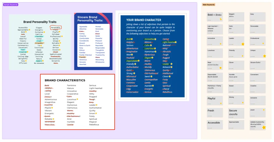
01 - Collect personality keywords
First, I made a list of possible personality keywords and picked the ones that could fit our product.
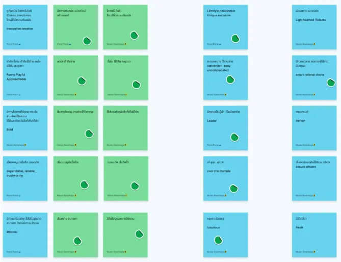
02 - Group the keywords
I grouped keywords with similar meanings, so the survey would ask about clear ideas instead of near-duplicates.
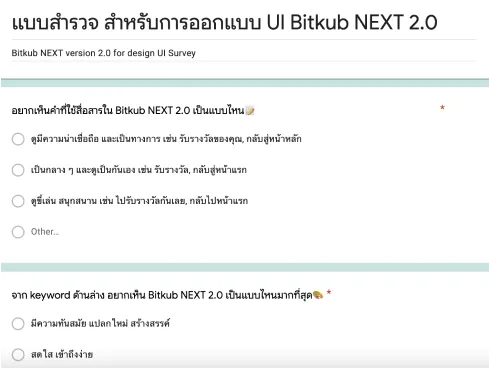
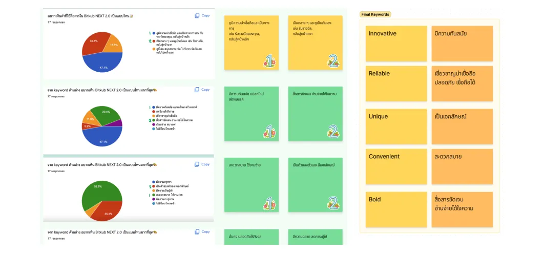
03 - Survey the company
We wanted everyone involved. The survey asked employees and C-level executives which of these ideas the new version should express.
04 - Five keywords
The survey gave us the five keywords people chose most often. These became the product’s personality.
05 - Survey customers
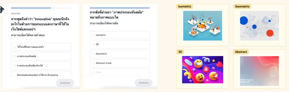
Next, I wanted to know how customers would actually recognise that personality. So we asked them directly. For example, to learn how to make the product feel “innovative”, we asked: “When you think of something innovative, what comes to mind?”
The answers showed us what to invest in. For example, if most customers said micro-interactions make a product feel innovative, that is where we would put more effort.
06 - Research interfaces
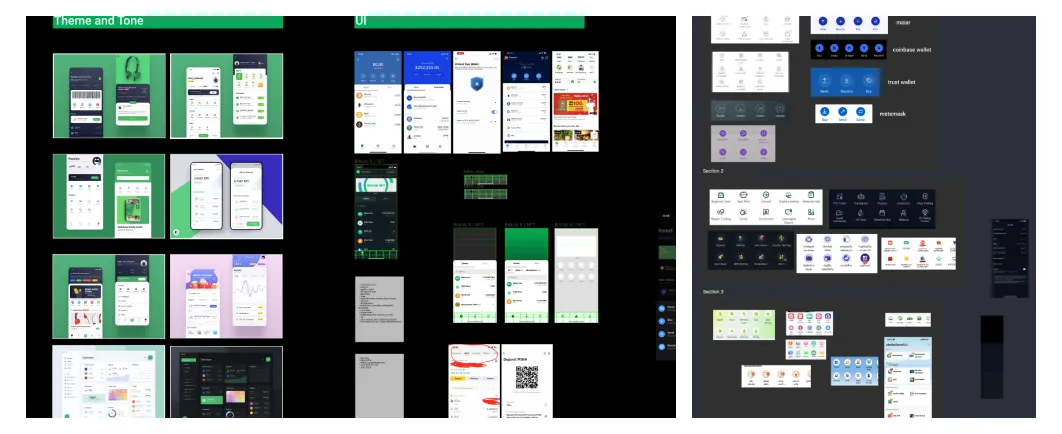
With a clear personality and a sense of how customers would perceive it, I researched global products, both direct and indirect competitors, to see where interface design was heading.
The result
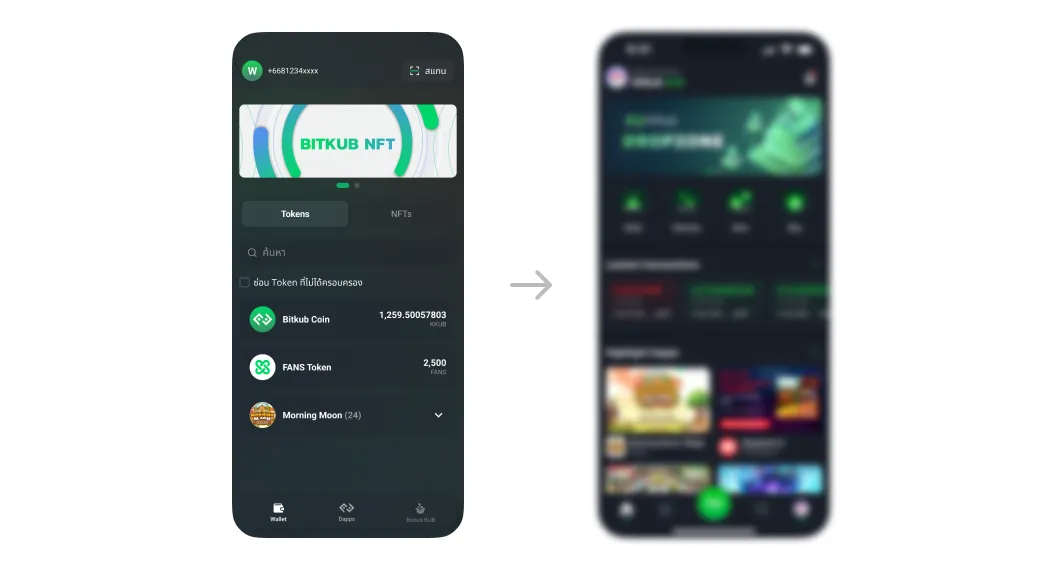
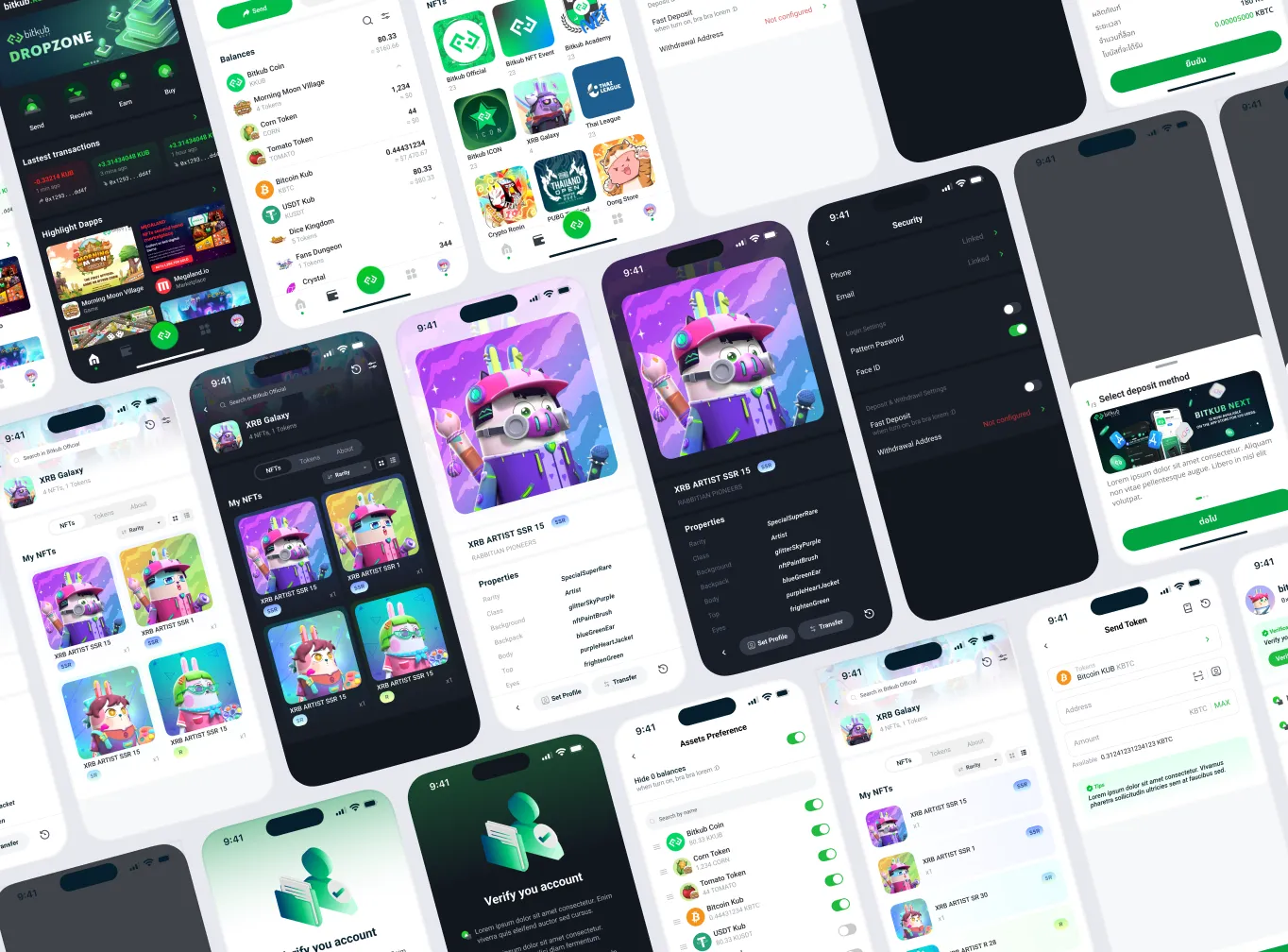
I explored many rough designs based on the product personality: the overall look and feel, the style of icons and illustrations, and colour palettes for both light and dark themes.
After rounds of feedback and revision, we had a solid UI concept for the new version.
What I learned
When I first saw the five keywords, I already had a picture of what the UI should look like. The survey proved me wrong.
“Innovative” was one of the five keywords, and I assumed that meant 3D illustrations. Customers said 2D isometric illustrations felt more innovative. A hypothesis is a good place to start, but it should never overrule what people actually tell you.
