
Overview
A year and a half after launch, Bitkub NFT was hard to scale. We had kept adding features without improving the experience of what already existed, and both design debt and technical debt had piled up.
So we started a complete redesign of the interface, one that still had to work with every feature the product already had.
Challenge
- Technical debt and the limits of the blockchain made many design options hard or impossible.
- There was a lot of design debt and very little time to revisit it.
- What was running in production no longer matched the design.
The approach
- A shared way of working with developers. I onboarded front-end developers to design tokens, and we set up Storybook so designers could check that every component and property matched the design and the requirements.
- New flows, explained early. I drafted the new flows and walked back-end and smart contract developers through them, so they understood the new requirements before building.
- Fix what we had missed. Micro-interactions, layout and responsive design were not good enough in the first version, so they got real attention this time.
01 - Review the feedback
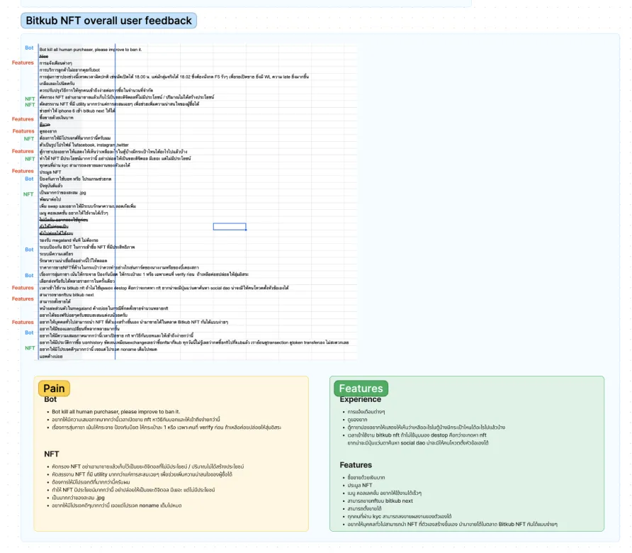
I started from the feedback and survey I had run the year before, to see what people thought of the product, and listed the pain points a new design could solve.
I sorted the feedback into three groups: problems design could solve, problems that needed a change in business flow and logic, and problems caused by technical or blockchain limits. I focused on the first two, because they would take the least effort for the most improvement.
02 - Read the data
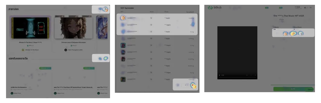
Next I looked at the analytics we were already tracking. Heat maps in Hotjar were the most useful: they showed what people actually interacted with on the most important pages, the homepage, Gashapon and the NFT pages.
03 - Simplify the flows
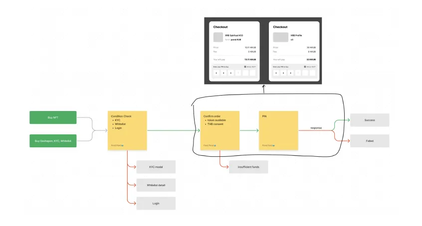
I reviewed the flaws in the existing design, such as duplicate components and separate flows that could be merged.
For example, NFT checkout and Gashapon checkout had separate flows and separate logic. Combining them into a single checkout flow made the product easier to use and much easier to maintain.
04 - Research other platforms
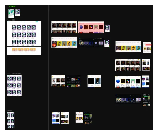
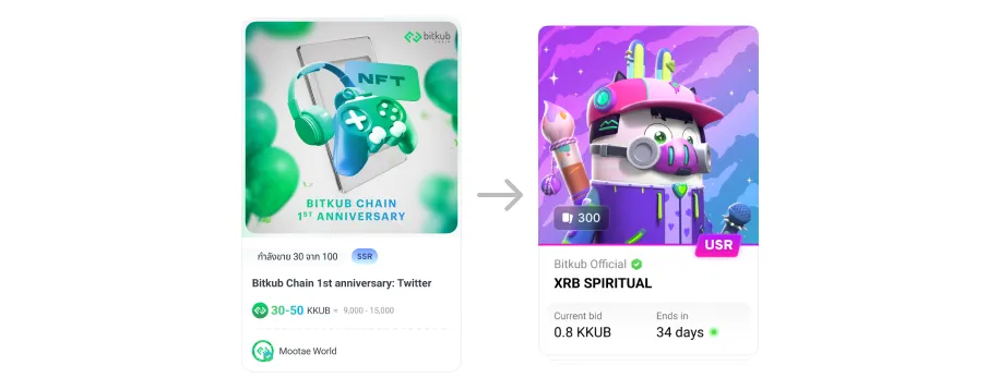
I studied how other NFT platforms laid out their interfaces, comparing grids, layouts and UI components to understand the pros and cons of each, then adapted what worked into our own.
05 - Wireframe the whole platform
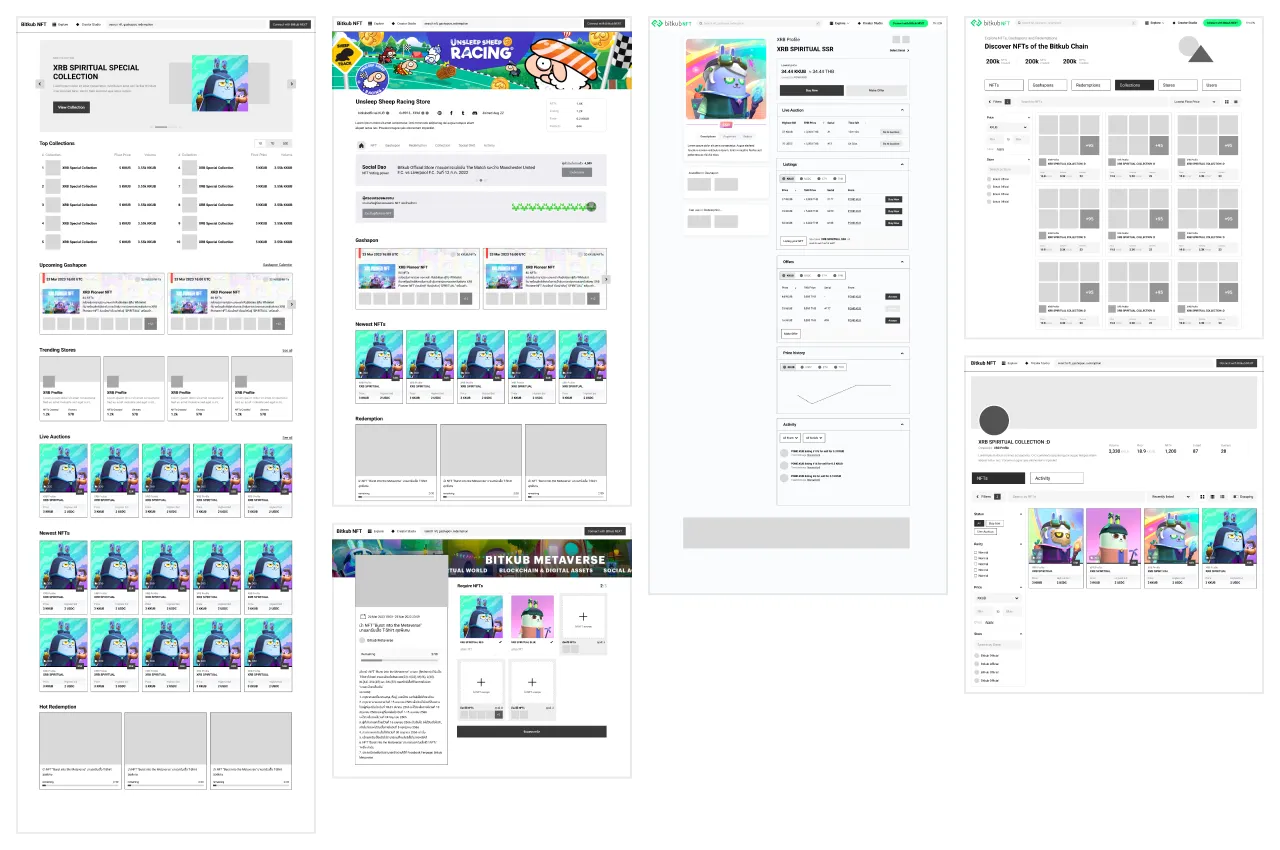
I wireframed the entire platform quickly, improving the experience while fitting the new business requirements.
06 - Discuss with the product team
I presented the wireframes to the product team and explained how the design and the new flows improved the experience. We compared options, chose the strongest direction to take into UI, and collected feedback for the next round.

07 - Final design
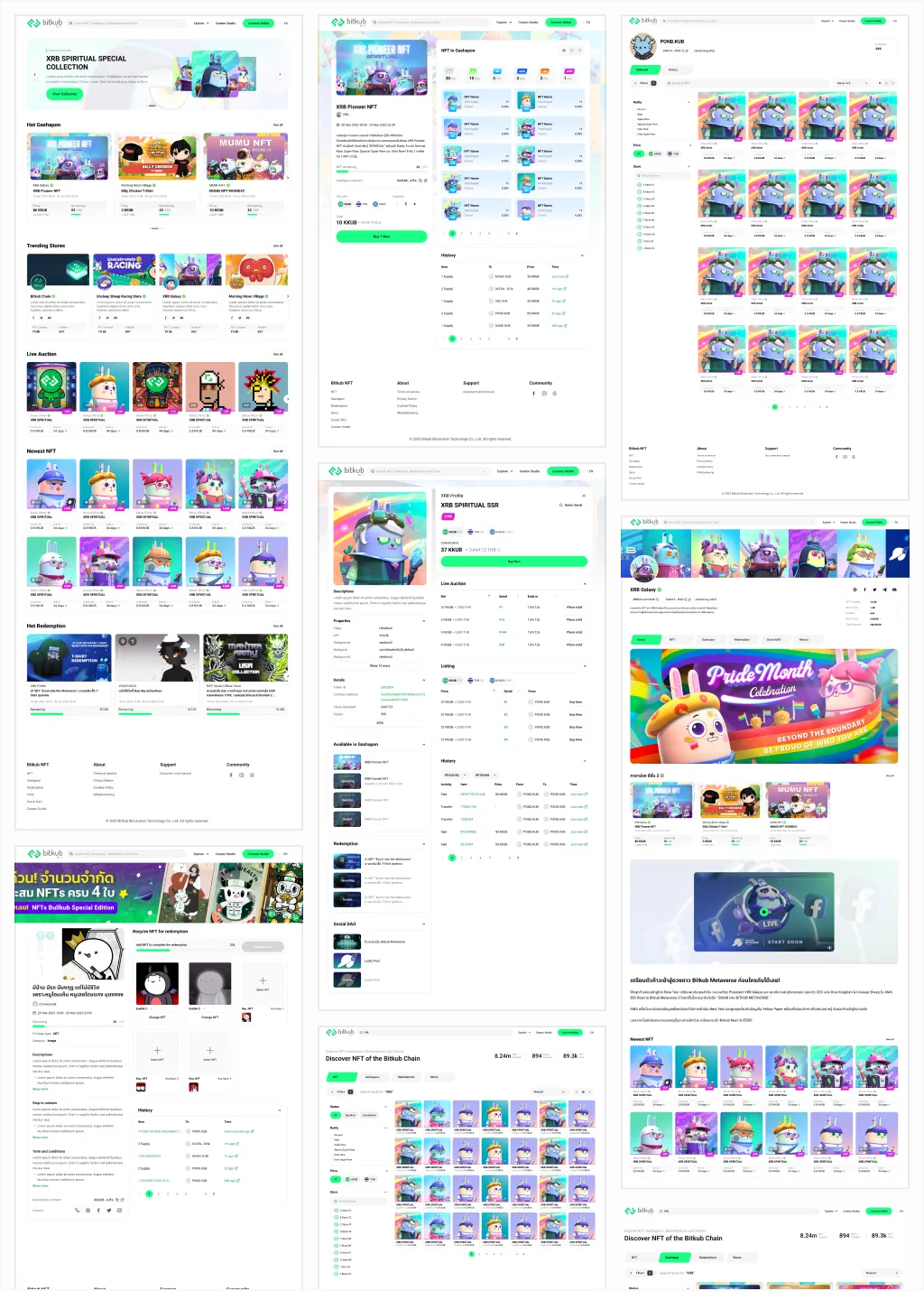
I built the final UI components, the design tokens and the responsive layouts, and handed everything over to developers.
With solid requirements and a tested new flow, the team rolled the new design out feature by feature.
What I learned
- Google Analytics and Hotjar taught me a great deal about real behaviour: how customers used the product, where our design was wrong, and how to improve it.
- How to make business requirements work within the limits of a blockchain, through design.
- How design choices can save money, for example by reducing load on our servers.
- How a shared UI framework and a clear handoff process let designers make sure what gets built does not drift from the design.
