
Overview
Mica is the product behind NDLP, the National Digital Learning Platform of Thailand’s Office of the Basic Education Commission. Its goal is to give every student and teacher access to quality learning material, anywhere and at any time.
I am the lead designer for Mica at SkillLane. The platform serves five very different groups of people in one product, from a student watching a lesson on a phone to a central office managing schools nationwide.
About the visuals. Mica is a government platform, so the images in this case study are illustrative mockups made for this portfolio, not screenshots of the live product. The real platform is at ndlp.go.th.
The challenge
- Five roles, one product. Students, teachers, school administrators, the central office and regional offices all log in to the same platform, but each has different jobs and different permissions.
- The language of Thai schools. Teachers plan lessons around the national curriculum, its learning areas and its indicator codes. A generic course platform does not speak that language.
- Very different learners. Some students study on a phone with a limited data plan. Others plan long study sessions on a laptop. Both need to succeed.
Understanding the learners
Research with 29 upper secondary students (aged 16 to 18) showed two clear patterns, which became our two personas.
| Nong Mobile | Nong Study | |
|---|---|---|
| Device | Phone | Laptop or computer |
| Preferred media | Short video, images, audio | In-depth articles, PDFs, long video |
| Internet | Mobile data, often limited | Home or school, stable |
| Goal | Understand quickly, get better grades | Plan ahead, prepare for exams |
| Main pain point | Slow internet, loses focus easily | Content scattered, nowhere to take notes |
| Design priority | Mobile first, large type, short content | Desktop layout, split screen, export |
Designing for both meant every learning screen had to work on a small phone with a slow connection first, then scale up for students who want depth.
Speaking the language of Thai schools
Before designing screens, I documented how the Thai education system actually works, so every design decision started from the same understanding.
- Curriculum. The core curriculum is organised into 8 learning areas with specific indicators, such as science indicator codes teachers use every day when planning. Learning materials are grouped by these learning areas because teachers already think this way, and they can search by indicator code directly.
- Administration. How the central office, regional offices and schools relate to each other became the basis for roles and permissions.
- Assessment. National tests and school grading shaped how progress and reports are shown, so numbers mean something to teachers and administrators.
One map for five roles
To keep five roles consistent, I mapped every feature against every role in a single feature matrix: 76 features across 5 roles. A second pass against all five user manuals found 21 features we had missed and 2 permissions we had recorded wrongly, which is exactly the kind of mistake that becomes a bug if nobody catches it early.
| Feature | Student | Teacher | School admin | Central office | Regional office |
|---|---|---|---|---|---|
| Browse the learning library | ✓ | ✓ | ✓ | ✓ | ✓ |
| Create learning materials and lesson plans | ✓ | ✓ | ✓ | ||
| Publish without approval | ✓ | ||||
| Enrol in courses and earn certificates | ✓ | ||||
| Teach a class and mark it as taught | ✓ | ||||
| Manage users and roles | ✓ | ✓ | ✓ | ||
| Manage schools | ✓ | ✓ |
Designing assessment tools for teachers
Teachers asked for richer ways to check understanding than multiple choice. We are rolling out new question types in stages: fill in the blanks, matching, and grouping or sequencing.
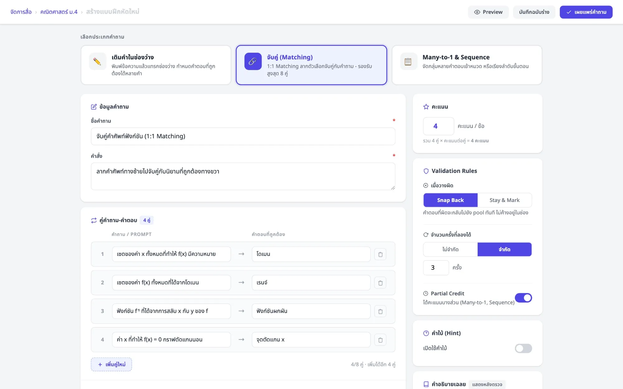
Illustrative mockup of the question creator, not the production UI.
The interesting design work was in the decisions teachers make, not the question types themselves:
- What happens on a wrong answer. Snap the answer back to the pool straight away, or let it stay and mark it wrong. One suits practice, the other suits testing.
- How many attempts a student gets, and whether partial credit is given when some pairs are right.
- A minimum pass rate per indicator. Teachers set the lowest acceptable score for each curriculum indicator in a test, so the platform can flag exactly which indicator a student is weak in, instead of just a single overall score.
Designing with AI, in context
Mica was the first product documented in Design Brain, the knowledge base I built for our design team. With the curriculum, roles, personas and 16 role flows written down, AI-assisted mockups start from Mica’s real context instead of generic education software. That let me explore more than 20 interactive concepts with product and engineering before committing to final designs in Figma.
The result
- 5 roles designed as one coherent product, backed by a feature matrix of 76 features.
- 16 role flows and a shared understanding of the Thai education system, documented for the whole team.
- A design process where research, domain knowledge and AI-assisted exploration feed each other, so new features start from what we already know.
What I learned
On a platform this broad, the hardest design problem is consistency across roles. Getting the underlying map right (who can do what, and in whose language) mattered more than any single screen.
